TYPEFACE DESIGN
Gobspeed
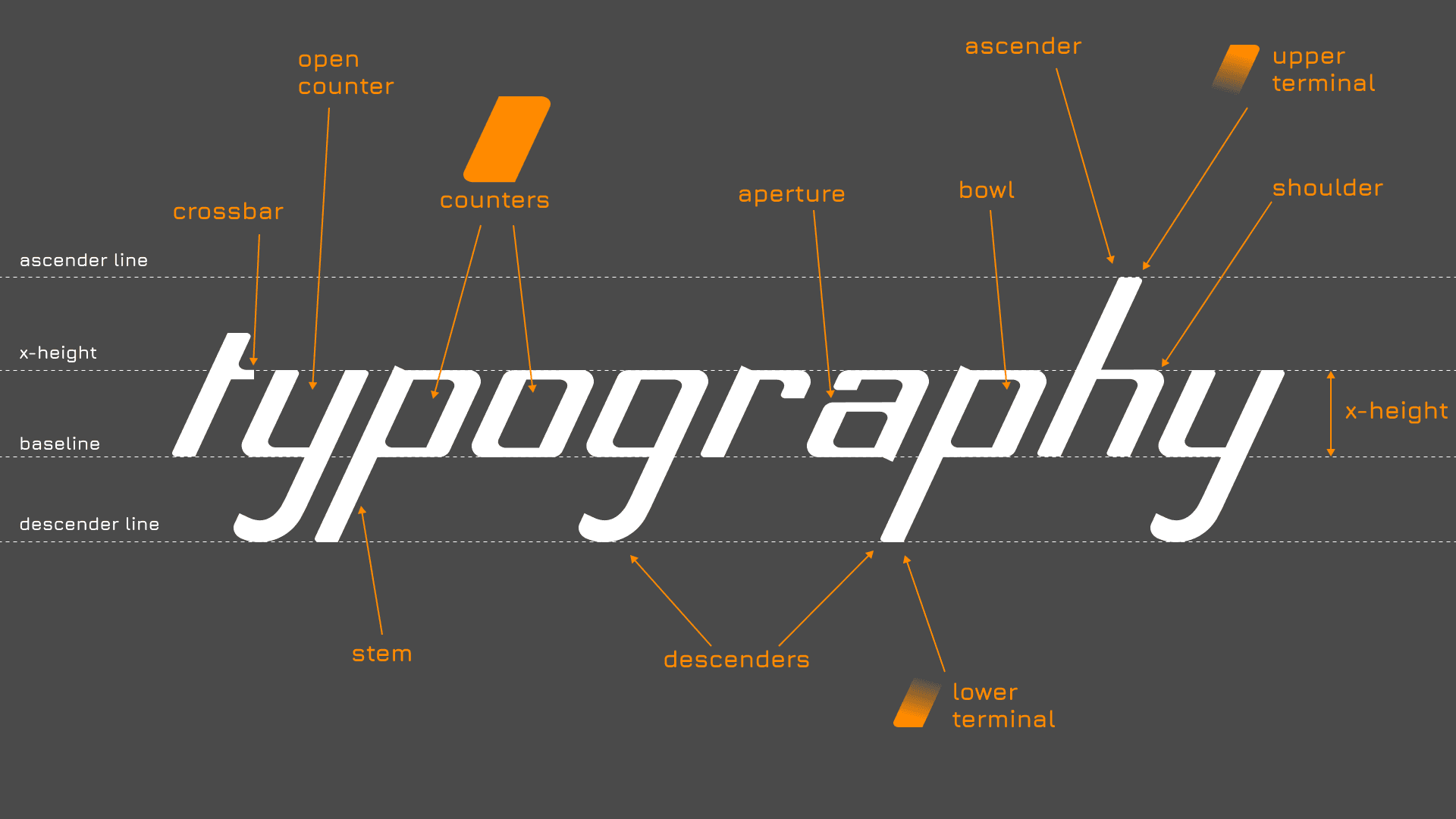
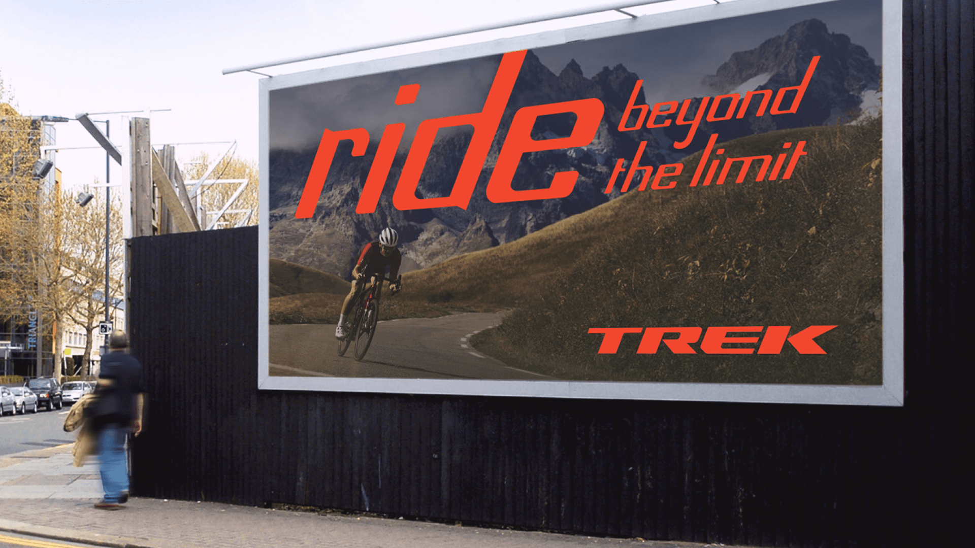
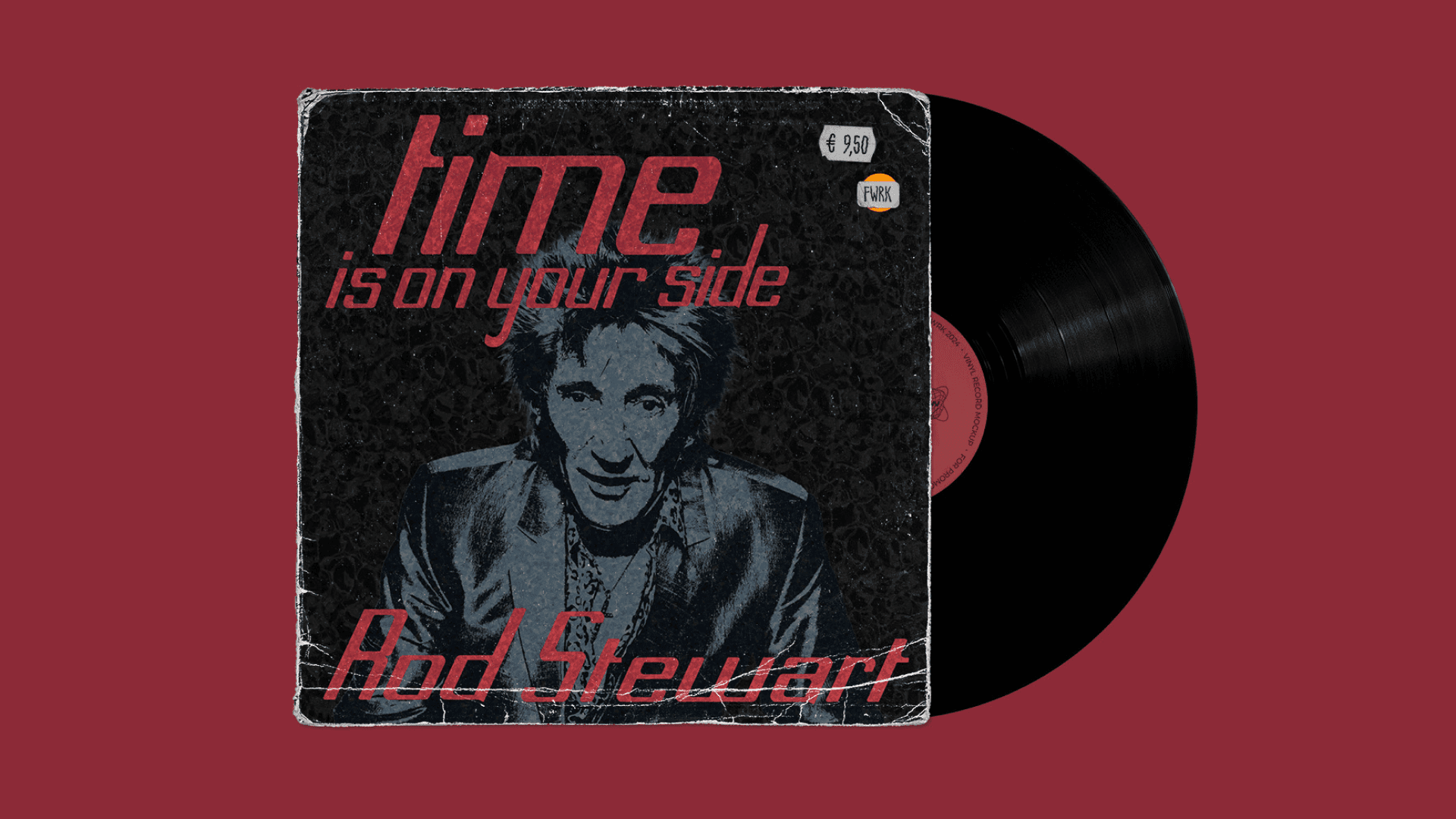
Custom typeface designed around a repeated counterspace and speedy, sloped stems.
Early sketches
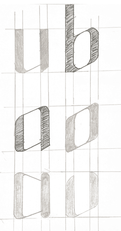
The initial idea included strong vertical pillars and sloping shoulders. Over time, the pillars became less of a defining characteristic.
Evidently, the characters were begging to be slanted. I was no longer working with classy pillars and shoulders, but with sleek and futuristic curves and counters.

Frankenstein's monster
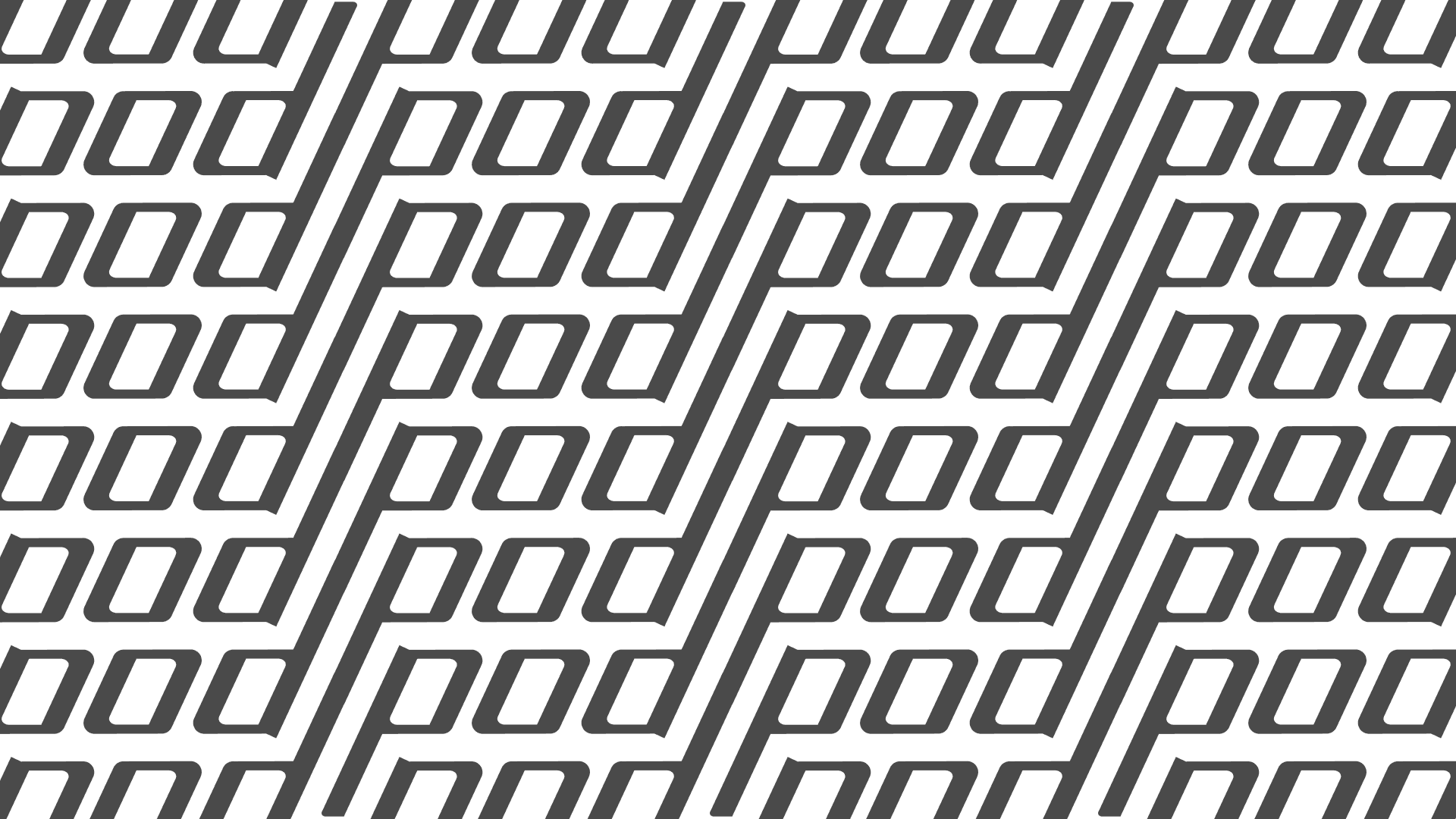
Here is a collection of pieces used to put together a vast majority of the typeface’s characters.
If you look closely, you might see several letters hiding inside of the figure.
TYPEFACE DESIGN
Gobspeed
Custom typeface designed around a repeated counterspace and speedy, sloped stems.


Early sketches
The initial idea included strong vertical pillars and sloping shoulders. Over time, the pillars became less of a defining characteristic.
Evidently, the characters were begging to be slanted. I was no longer working with classy pillars and shoulders, but with sleek and futuristic curves and counters.

Frankenstein's monster
Here is a collection of pieces used to put together a vast majority of the typeface’s characters.
If you look closely, you might see several letters hiding inside of the figure.


TYPEFACE DESIGN
Gobspeed
Custom typeface designed around a repeated counterspace and speedy, sloped stems.


Early sketches
The initial idea included strong vertical pillars and sloping shoulders. Over time, the pillars became less of a defining characteristic.
Evidently, the characters were begging to be slanted. I was no longer working with classy pillars and shoulders, but with sleek and futuristic curves and counters.

Frankenstein's monster
Here is a collection of pieces used to put together a vast majority of the typeface’s characters.
If you look closely, you might see several letters hiding inside of the figure.


Kishan made this website and loves making websites.
Kishan made this website and loves making websites.